Creative Mentoring Collective
Customized branding | Customized illustration
Creative Mentoring Collective (CMC) is an innovative online creative school dedicated to empowering neurodivergent adults through specialized creative classes. Founded on the belief that everyone deserves the opportunity to pursue their creative passions, CMC draws inspiration from the founder's firsthand experience managing a film school tailored for adults with disabilities.
CMC’s approach to teaching is unique and tailored to the students' needs. CMC understands that flexibility is key for the students, which is why we offer tailored schedules to accommodate their diverse lifestyles and commitments. Whether it's honing professional skills, unleashing artistic expression, or pursuing personal growth, CMC is committed to helping our students achieve their goals.
In approaching this project, we centered our focus on deeply understanding our target audience intimately. Our goal was to craft a brand that exuded fun and approachability while upholding inclusivity and clarity in its design elements, particularly in terms of color and typography. We needed to strike a balance between celebrating creativity and maintaining a level of maturity suitable for our audience, who were not children but still sought an engaging and enjoyable experience.
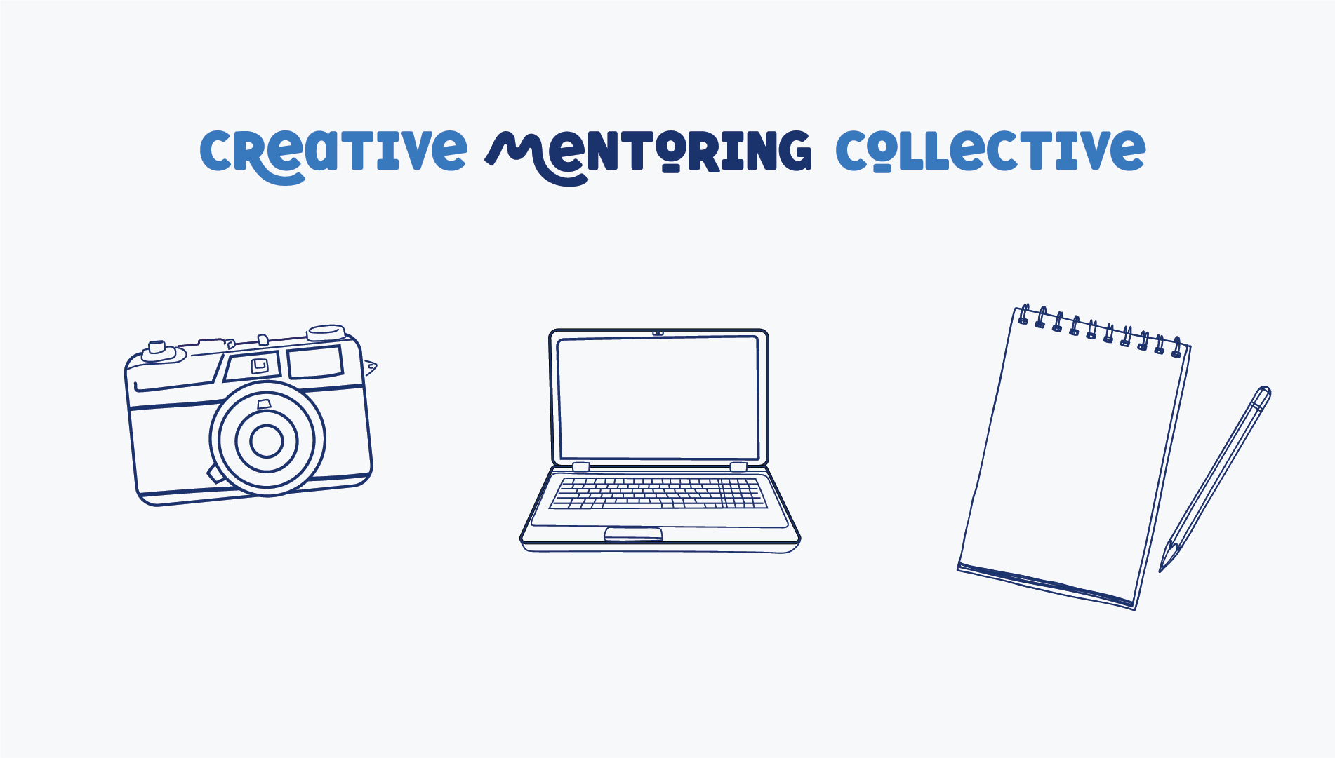
Moreover, we aimed to visually encapsulate the broad spectrum of creativity offered by the school, ranging from design and photography to writing. To achieve this, we selected drawing as our primary medium, recognizing its universal appeal as a tool for conceptualization across various artistic endeavors.
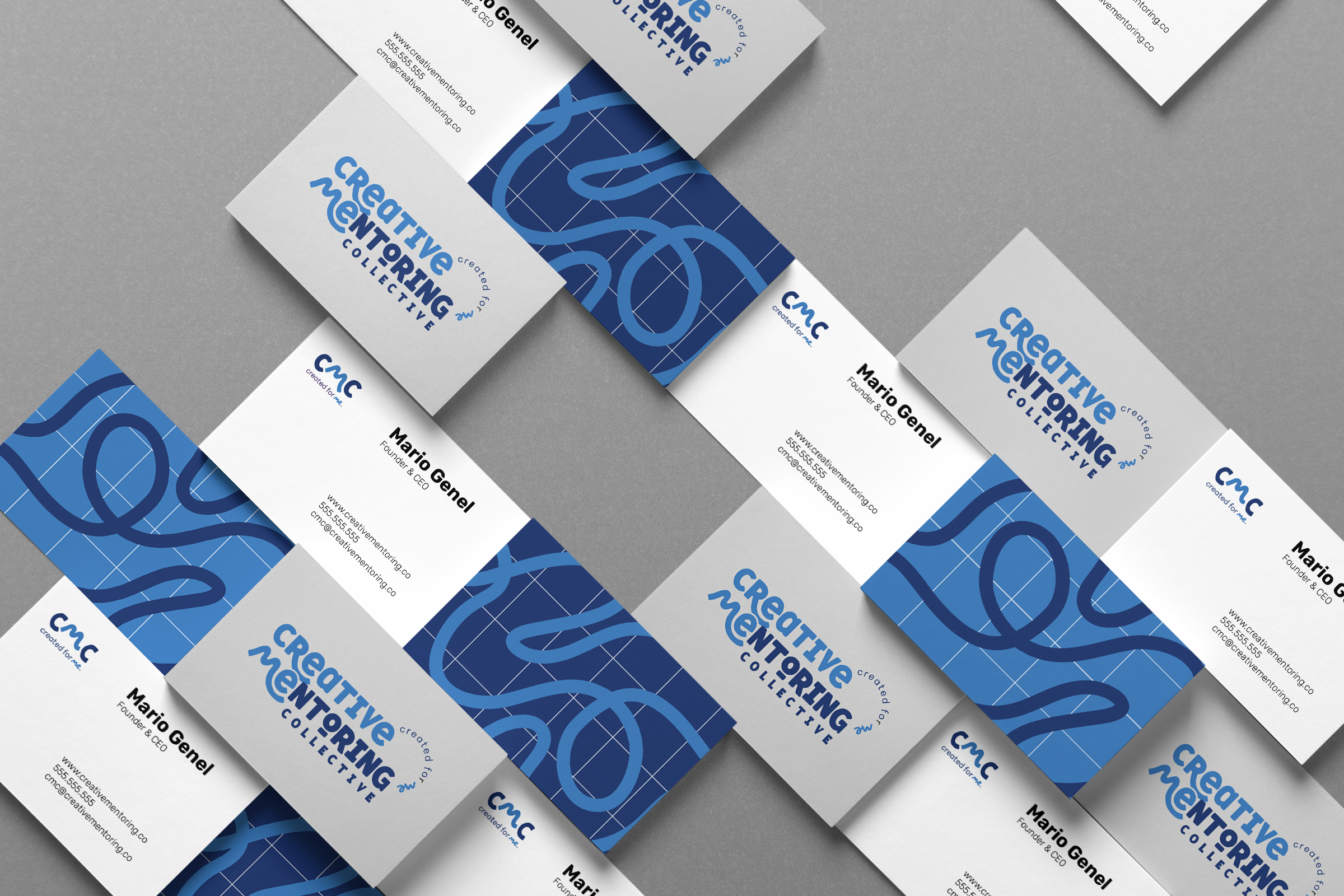
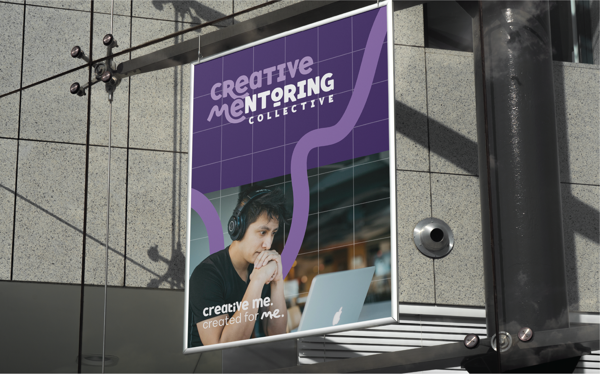
Our solution involved the integration of a playful, hand-drawn brand pattern complemented by a grid reminiscent of graph paper. Paired with whimsical illustrations and a quirky, sans-serif font, we ensured that the brand exuded a contemporary yet lighthearted vibe through its typographic elements.
Our design choices resulted in the selection of the brand persona developed during our ideation phase—the friendly professor—that embodied approachability and warmth—to guide students through their creative journey. Additionally, our deliberate selection of cool and tranquil colors, such as lavender and deep purple, resonated particularly well with their target audience, offering a subtle infusion of warmth amidst the predominant deep and light blues, grays, and neutrals of the primary color palette.


